A New Look: George Mason's Branding Initiative
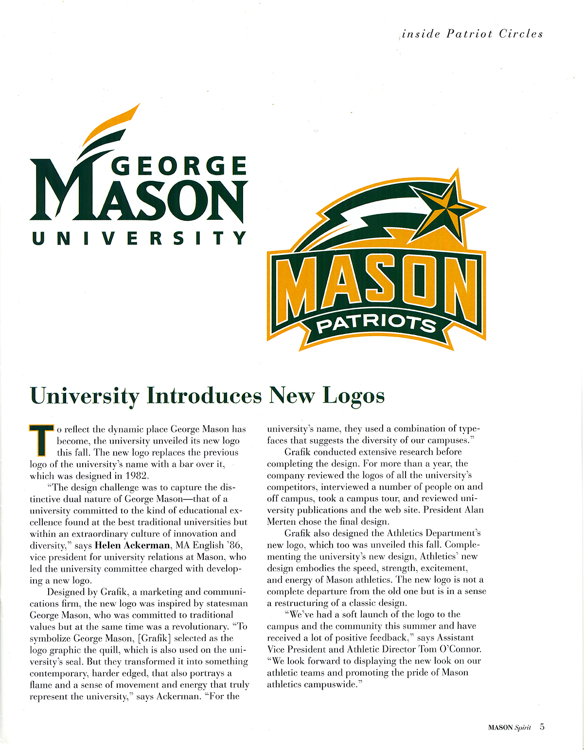
In 2003, George Mason University President Alan Merten and Helen Ackerman, Vice President for University Relations and a George Mason alumna, had decided that it was time for Mason to create a new institutional logo for both the University and its athletic teams. The then-current logo had been designed in 1982. [1] Ackerman explained, “We want people to know what a distinct place George Mason is…Creating a visual that people will recognize is one way to do that.”[2] The branding initiative was a task that neither took lightly, given the failed attempts Merten had seen at other universities with which he had been involved and the great amount of work it entailed for Vice President Ackerman.
Ackerman formed two committees: one to work on the university logo, which was more historical in nature (reminiscent of the university seal rather than a logo, according to Dr. Merten), and one to work on the athletic logo, which Dr. Merten “despised [because] it didn’t even have our name on it.”[3] Students and faculty members were active on both committees, and Ackerman also decided to hire a consultant—the company Grafik was chosen, and it examined competitor’s logos, conducted interviews, and took a campus tour. [4]
The university logo was examined first, and eight different designs were proposed. Dr. Merten made the final decision. [5] He was at first skeptical of his two remaining options, but soon realized the genius of the one he ultimately chose: “The university logo is subtle; you can mix and match [and customize] it any way you want—[for example], ‘George Mason’, ‘George Mason University School of Public Policy', etc. You can add to it.”[6] The logo “is meant to symbolize George Mason himself, a man strongly committed to traditional values but also a revolutionary in his own right.” The logo’s designers transformed the quill—a symbol of George Mason used on the university seal—to symbolize the essence of a flame, “a sense of movement and energy” that represents the University. [7] Ackerman added that the “University’s name…use[s] a combination of typefaces that suggests the diversity of our campuses.”[8]
The new athletic logo was not a “complete departure from the old [design], but [was] in a sense a restructuring of a classic design,” and it prominently displays the University’s name following Dr. Merten’s criticism of the former design. [9] Ackerman decided to incorporate “Mason” into the new logo because, according to Dr. Merten, “Students had already changed the name of the University: whatever we created for the logo, students were going to get hats and shirts on their own that said ‘Mason’ because they’d started calling the University by that name informally.” It was unclear exactly when or why that shift had occurred. [10] Designers felt that the “new design embodies the speed, strength, excitement, and energy of Mason athletics.” [11]
Marketing to students came through open houses in spring 2004, and the logos “were a huge hit immediately.” [12] Faculty also liked the new university logo because it could be tailored to their specific school or college. Ackerman and Merten “declared victory” through 2004 and 2005. The following year may have garnered the greatest acceptance and publicity of the new logos; when the Men’s Basketball team made it to the Final Four of the NCAA tournament in 2006, Dr. Merten noted that university officials estimated that “almost two hundred newspapers on some days had our athletic logo on their front page. [We gained] much more attention than we could have imagined.” [13]
Ackerman’s hope was that the new logo would “reflect the dynamic environment of a school committed to the kind of educational excellence found at the best traditional universities while also being committed to maintaining an extraordinary culture of innovation and diversity.” [14] The embracing of the design by the University and the national recognition of George Mason following the Final Four appearance confirm that vision.
Browse items related to George Mason logos.
